
You scroll past your own video at 9pm and it takes a second to recognize it. Muted, the hook is a grey line of subtitle text that appears, holds, and vanishes while the first three seconds of footage do nothing to stop your thumb. The cut is fine. The audio is fine. The text is the problem.
That's the shift most creators are still catching up to. On-screen type used to be a post-production chore: keyframe the words, ease the scale, time the entrance to the beat, then repeat the whole thing for every hook variant and every aspect ratio. AI text effects now handle timing, styling, and layout from a transcript, a script, or a single prompt, which moves the job up a level. You're no longer building animations by hand. You're choosing which effect does which job, and knowing where each one breaks.
The eight below are sorted by the work the text is doing: holding attention, localizing a cut for a new market, structuring a longer video, branding a channel, and selling a product. Each one gets its failure mode and the preset-level tweak that separates a clean result from something that looks auto-generated. TikTok's Spark Ads breakdown is a useful reference for how that text behaves inside paid placements, where the same rules apply with less tolerance.
Table of Contents
- 1. AI Word-by-Word Kinetic Captions for Holding Attention
- 2. AI Multilingual Subtitle Translation and Re-Voicing for Localizing
- 3. AI Kinetic Typography Titles and Scene Transitions for Structuring a Video
- 4. AI Hook Text Overlays for Stopping the Scroll
- 5. AI-Generated Text in Images for Selling Inside the Visual
- 6. AI Stylized 3D, Neon, and Chrome Text for Branding
- 7. Beat-Synced Lyric and Text Animation for Holding a Rhythm
- 8. AI Brand Caption Presets and Reusable Text Templates for Consistency
- How the eight AI text effects compare
- Pick One Effect, Build a Preset, and Test It This Week
<a id="1-ai-word-by-word-kinetic-captions-for-holding-attention"></a>
1. AI Word-by-Word Kinetic Captions for Holding Attention
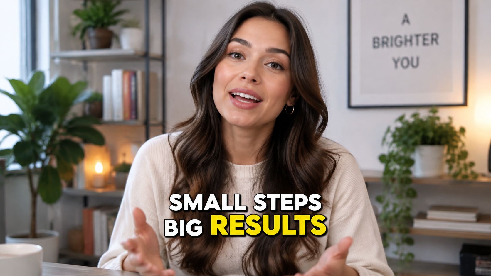
Kinetic captions put speech on screen one word or short phrase at a time, each word landing with the voice. AI transcription does the alignment, timestamping every word, then a preset supplies the look: bold uppercase type, a color pop on the active word, a small scale bump, a hard drop shadow. It's the most-used text effect in short-form video because it works with the sound off and reinforces the spoken line instead of competing with it.
A typical use: a 40-second talking-head ad where the pitch hits a price at second 12. The preset should pop that price in a contrasting color, hold it half a beat longer than the words around it, then drop back to the base style. Everything else stays quiet.
<a id="the-failure-mode-nobody-catches-in-the-timeline"></a>
The failure mode nobody catches in the timeline
Sync drift. The transcript is right, the render is right, and the caption still trails the voice by a beat because the audio was trimmed after alignment or the music bed was swapped. Captions also break in motion: a word that's perfect in one frame can morph, flicker, or disappear behind a hand three frames later.
The ACM benchmarking work on text effects treats this as a separate measurement problem. STRICT scores generated text against the requested string with normalized edit distance, character error rate, and word error rate, while T2VTextBench targets on-screen text fidelity and temporal consistency in text-to-video generation. Sample frames through the whole caption run, compare OCR output with your script, and score legibility separately from frame-to-frame stability.
Captions fail quietly. Nobody flags the word that appeared for four frames instead of six.
Rules that keep the preset clean:
- Two to four words per line, so the eye finishes before the next line replaces it.
- One highlight per sentence, on the keyword or the call to action, never on every noun.
- Stay clear of the right-hand button rail and the bottom caption block on vertical feeds.
- Save the finished style as a preset so every clip in the series matches. The settings that carry over are covered in this guide to adding subtitles to a video.
<a id="2-ai-multilingual-subtitle-translation-and-re-voicing-for-localizing"></a>
2. AI Multilingual Subtitle Translation and Re-Voicing for Localizing
Localization is the effect that pays for itself, and the one often postponed. The pipeline takes your transcript, translates it, re-times the captions to the new narration, and optionally re-voices the audio so pacing and phrasing still match. One shoot becomes five markets without a second edit.
Say a DTC skincare brand has a 30-second ad that works in the US. Spanish, German, and Japanese versions can ship from the same cut, each captioned in its own language, with the hook rewritten where a literal translation lands flat.
<a id="where-localization-breaks"></a>
Where localization breaks
Expansion. German and Spanish run longer than English, so a caption that sits on one line in the source overflows in the target. The fix isn't a smaller font on export, it's shorter source sentences written with translation in mind, plus a phone-screen check on the translated cut before a media buyer touches it.
Then the naming problem. Product names, slogans, and trademarked terms should survive untouched. Build a do-not-translate list into the preset so no model rewrites a serum name into something with a different legal meaning.
Disclosure needs the same care, and the evidence is more conditional than the usual advice suggests. Poynter's 2025 reporting on audience attitudes to AI found that more than half of Americans had little or no confidence in newsrooms using AI for articles or images, while more than 90% of highly news-literate consumers wanted disclosure for AI-generated text and photo editing. For a translated product ad, a brief process note is enough. For health, finance, or testimonial content, pair the label with visible human review and source verification.
Durable rule: translate the message, not the layout. One reviewed cut per market beats five rushed ones.
- Lock the glossary first, before a single line gets translated.
- Test one language fully, then scale the workflow to the rest.
<a id="3-ai-kinetic-typography-titles-and-scene-transitions-for-structuring-a-video"></a>
3. AI Kinetic Typography Titles and Scene Transitions for Structuring a Video
Kinetic typography is structure you can see. Words slide, scale, flip, or wipe in to mark a section change, a numbered step, or a claim worth remembering. AI builds the motion from a prompt, a script, or an outline, choosing easing, layout, and transitions from a style reference, so a three-minute tutorial gets chapter cards without a motion designer on the clock.
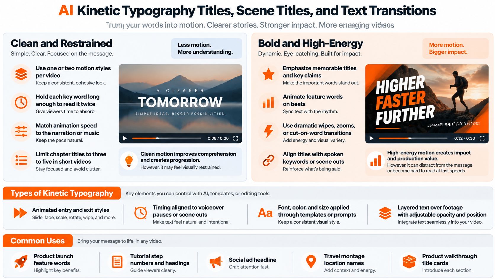
A worked example: a product walkthrough with four features. Each feature gets a two-word title card that slides in on the first spoken word of its section, holds long enough to read twice, and exits on a hard cut rather than a fade. Same motion, four times. The repetition is what makes it read as structure instead of decoration.
<a id="the-failure-mode-is-title-sprawl"></a>
The failure mode is title sprawl
Every section gets a card, then every sub-point, then a lower third, and the video becomes a slideshow with footage behind it. Short-form tolerates two or three structured breaks, not eight.
The drafting half of this job is already compressed. A 2024 Carnegie Mellon University study found generative AI cut graduate students' average writing time by 65% and raised average writing quality from B+ to A, as Heinz College reported. What's left is judgement about where the breaks belong and which word carries each one.
A timed motion pass looks like this when the entrances match the narration and the type holds long enough to read:
<iframe width="100%" style="aspect-ratio: 16 / 9;" src="https://www.youtube.com/embed/16kTqBUh8mM" frameborder="0" allow="autoplay; encrypted-media" allowfullscreen></iframe>Settings that keep it clean:
- One or two motion styles per video, chosen before the first render, not added mid-edit.
- Align each title to the first spoken word of its section rather than to the music.
- Read the generated outline before rendering, because a wrong order costs a full rebuild.
- Match easing to energy: fast cuts for hooks, slower slides for explanation.
<a id="4-ai-hook-text-overlays-for-stopping-the-scroll"></a>
4. AI Hook Text Overlays for Stopping the Scroll
The hook is the only text most viewers will read. It goes up in the first frame, before anything has been explained: a question, a claim, a number, a warning. AI generates variants from your topic in seconds and styles them to the channel, which means the constraint isn't production anymore. It's choosing a claim the footage can support.
Say a fitness creator has a 25-second deadlift clip. The plain version opens on the lift. The hooked version opens on the words "Stop rounding your back" in the same frame the bar leaves the floor, and the viewer stays to find out whether the claim holds.
<a id="the-failure-mode-is-a-hook-the-video-cant-cash"></a>
The failure mode is a hook the video can't cash
Overpromising buys one view and costs the next ten. The viewer who stayed for a fix that never arrived doesn't scroll past your next clip; they remember the account that wasted their time.
A hook that outruns the footage works once. The second video from that account gets scrolled.
Audiences read the format fluently now. In 2025, 66.5% of UK young people aged 13 to 18 reported using generative AI, down from 77.1% in 2024, according to the National Literacy Trust. Viewers who have made their own clips spot template phrasing instantly, and a generic hook reads as an ad even when it isn't one.
- Keep the hook under about eight words so it's readable in a single second.
- Test three to five variants on the same clip before committing to a winner.
- Name the viewer's problem, not the product category.
- Exit or move the hook by second three so it stops covering the payoff.
<a id="5-ai-generated-text-in-images-for-selling-inside-the-visual"></a>
5. AI-Generated Text in Images for Selling Inside the Visual
Some text can't live in an overlay. The brand name on a bottle, the price on a poster, the headline painted on a wall in the scene: it belongs inside the image. Modern generators render readable words in the composition, which makes them usable for thumbnails, product cards, and ad frames where the type is part of the picture rather than a sticker on top of it.
Say a coffee brand wants a thumbnail of a bag on a counter with the roast name legible. Generating the bag with the label spelled correctly saves a product shoot for a frame that runs for one second.

<a id="where-generated-text-fails"></a>
Where generated text fails
Spelling under complexity. The DEsignBench evaluation of DALL-E 3 tested 40 visual-design samples with Azure OCR and exact word matching, and found the model rendered English text more reliably than earlier systems while still producing errors on more complicated strings and layouts. Short, high-salience words come back clean. Long slogans, small print, and curved surfaces don't.
That's why the working method is hybrid: generate the image, then rebuild any commercially material word (price, URL, product name) as a typography layer in the editor. For the photography side of the same workflow, this guide to AI product photography covers how light and surface behave when the frame is generated rather than shot.
- Quote the exact words in the prompt, then describe font weight, color, and placement.
- OCR every export and track word-level exact match plus character error rate.
- Block the export when a material word comes back wrong, no matter how good the frame looks.
- Score layout and color separately from text accuracy, because a frame can be beautiful and still misspell the brand.
<a id="6-ai-stylized-3d-neon-and-chrome-text-for-branding"></a>
6. AI Stylized 3D, Neon, and Chrome Text for Branding
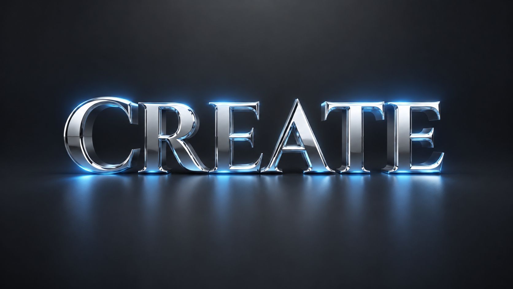
Stylized text is branding at the scale of a word. Extrusion, neon glow, chrome, glass, metal, glitch: AI applies a surface treatment from a style prompt or a reference frame and composites the result over footage or into a still. It replaces lighting and material work that used to need a 3D artist, and it does it in the time it takes to describe the look.
Say a music producer needs a title card for a single. A chrome wordmark with a blue rim light opens the visualizer, holds through the first bar, and cuts on the drop. One element, one treatment, no other graphics competing with it.
<a id="the-failure-mode-is-contrast-collapse"></a>
The failure mode is contrast collapse
Stylized type looks strongest in the preview window and weakest on a phone in daylight. Chrome catches a highlight that turns a letter into a grey smear, neon bloom eats the counters of an "e", and a dark treatment over dark footage disappears entirely.
Test at thumbnail size, not at full screen. If the word survives at 30 percent scale, it survives the feed.
The other trap is using the effect for sentences. A three-word title in chrome reads as a title. A full line of copy in the same treatment reads as a screensaver.
- One stylized element per scene, and let it be the loudest thing in the frame.
- Pull the color from the brand palette, not from whatever the style reference happened to use.
- Keep a flat version of the same wordmark for busy footage and small placements.
- Check mobile contrast before export on the phone you carry, not a calibrated monitor.
<a id="7-beat-synced-lyric-and-text-animation-for-holding-a-rhythm"></a>
7. Beat-Synced Lyric and Text Animation for Holding a Rhythm
Beat-synced text is rhythm made visible. Lyrics, a song title, or a single word land on the beat rather than on a fixed interval, and the whole edit feels mixed instead of assembled. AI detects tempo and beat positions in the audio, then times text entrances, scale changes, and transitions to those moments.
Say an independent artist cuts a 15-second version of a chorus. The title flashes in on the downbeat, one line pulses once per bar, and the artist name lands on the final hit. It's the same footage three times over, and the text does all the work of holding attention.
<a id="where-beat-sync-fails"></a>
Where beat sync fails
It lands on the grid and not on the vocal. A lyric that hits the beat but leads the sung word by a fraction of a second reads as broken, especially on hook lines that get watched ten times in a row. Tempo detection is reliable; word-level alignment to a sung vocal is not, so the chorus needs a manual pass.
The other failure is density. When every beat gets a scale pop, the viewer stops reading and starts waiting for the next flash.
- Correct the chorus and hook lines by hand and let the verses ride the automatic timing.
- Keep one typography set across releases so the visuals build artist recognition instead of resetting it.
- Cut short versions from the strongest drops for social rather than trimming the long edit.
- Confirm lyric rights with the publisher or licensing service before posting, since sync and mechanical licenses are separate permissions.
For shoot and edit concepts that pair with this style, these music video ideas cover the setups that work at small budgets.
<a id="8-ai-brand-caption-presets-and-reusable-text-templates-for-consistency"></a>
8. AI Brand Caption Presets and Reusable Text Templates for Consistency
A preset is a text style saved as a complete package: font, color, animation, position, and timing rules. AI can generate the first version from a brand description, a reference image, or an example video, then adapt the layout to each aspect ratio automatically. For a team publishing twenty assets a week, the preset is the difference between a brand and twenty people's separate guesses.
Say an agency runs five client accounts. Each gets one caption preset and one title preset, tested on 9:16, 1:1, and 16:9, and nobody ships a Reel with a font that isn't in the approved file.
<a id="the-failure-mode-is-preset-drift"></a>
The failure mode is preset drift
Someone adds a stroke because a client asked once. Someone else changes the highlight color. Six months later the feed looks like five different channels, and nobody can point to the file that broke it.
Preset discipline: version the template the way you version code, with a one-line changelog and a named owner.
The productivity case is stronger than it looks. In the randomized experiment by economists Shakked Noy and Whitney Zhang, summarized in the OECD review of generative AI's effects on productivity, 453 college-educated professionals completed occupation-specific writing tasks; ChatGPT cut average completion time by 40% and raised evaluator-rated quality by 18%, and the gains narrowed differences between workers with different baseline abilities. Templates do the same thing for video, letting a junior editor land near a senior's output. A caption generator for video with saved styles is the practical version of that idea.
- Build separate presets for ads, tutorials, and organic posts rather than forcing one style across all three.
- Test every preset on all three aspect ratios before it's approved for the team.
- Keep a short list of approved colors and fonts in the library. Visual identity works like musical identity does for an artist: repetition is what makes it recognizable.
- Review the library quarterly, since platform type styles move and old presets start to look dated.
<a id="how-the-eight-ai-text-effects-compare"></a>
How the eight AI text effects compare
| Effect | Best for | Main limitation | Typical format |
|---|---|---|---|
| AI Word-by-Word Kinetic Captions | Talking-head, ad, and educational clips | Can feel busy; transcription may need correction | Word-by-word captions with active-word highlights |
| AI Multilingual Subtitle Translation and Re-Voicing | Localizing videos for international audiences | Translations and voiceover timing need review | Translated subtitles, optionally paired with re-voiced audio |
| AI Kinetic Typography Titles, Scene Titles, and Text Transitions | Tutorials, explainers, and product launches | Excessive or poorly timed motion can distract | Animated titles, chapter cards, and text transitions |
| AI Hook Text Overlays | Short-form videos and ads that need a strong opening | Generic hooks can feel like clickbait or obscure visuals | Large, high-contrast opening text |
| AI-Generated Text in Images (Typography in Visuals) | Product mockups, thumbnails, and promotional visuals | Generated text may contain errors or miss brand fonts | Text integrated into images, signs, labels, or packaging |
| AI Stylized 3D, Neon, and Chrome Text Effects | Title cards, logos, and energetic branding | Effects can hurt readability or look inconsistent with footage | Short 3D or material-styled titles |
| Beat-Synced Lyric and Text Animation for Music Videos | Lyric videos and music promotion clips | Lyric timing may need correction; rights must be cleared | Lyrics or titles animated to beats and vocal phrases |
| AI Brand Caption Presets and Reusable Text Templates | Teams and agencies producing videos at scale | Templates can become repetitive or need layout fixes | Reusable caption and text-style presets |
<a id="pick-one-effect-build-a-preset-and-test-it-this-week"></a>
Pick One Effect, Build a Preset, and Test It This Week
Eight effects is a menu. Order one dish. Pick the effect that answers your most urgent job, whether that is holding attention, localizing, structuring, branding, or selling, and ship it before you touch the others.
Match the pick to the problem. If retention is the problem, start with word-by-word captions: fix the line length, choose a single highlight color, and apply the same preset to your last five clips so you can see whether watch time moves. If growth has stalled because everything you publish is in one language, take your best-performing ad into one new market, review it on a phone, and add a second language only when the first one converts. If inconsistency across a team is the drag, start with the brand preset, because every other effect inherits its font, color, and timing from there.
Build the preset before you test the effect. A saved preset with a fixed font, color, position, and exit timing turns one editor's taste into a system the whole team can apply. Export it to 9:16, 1:1, and 16:9 in the same session and look at all three on a phone rather than a monitor, since that is where captions collide with the button rail and where chrome text flattens to grey.
Then run a small test with one clear measure. Two hooks on the same footage with the same caption style will show a retention difference inside a day. Two presets across the same series will show which one reads better in the comments. Change one variable at a time; swapping the effect, the preset, and the content together tells you nothing about which one moved the number.
The step people skip is checking the text itself. Run OCR on every export before it publishes, sample frames through any animated section, and keep human review on the words that carry commercial or legal weight: prices, product names, URLs, claims. When a word is wrong, fix that single line in the Studio rather than regenerating the whole video.
ClipNova compresses this loop. It turns a prompt, a script, or a topic into a finished video up to five minutes long with voiceover, captions, and music assembled, translation and re-voicing into one of 18 narrator languages, and exports in 9:16, 1:1, and 16:9 from the same project. The preset you build in week one carries from first draft to publish-ready file in every aspect ratio. Start with one preset, run it across a week of posts, and compare the retention curve against what you published before. Visit ClipNova to generate your first captioned video from a prompt and check how the style holds up on a phone screen.
Ready to ship your own?
Start creating viral videos with AI in under twenty minutes, no credit card required.